You all might aware about the popularity of CSS framework Bootstrap.You can use Bootstrap for almost any task in the development and design of the website.
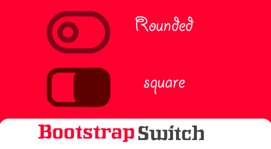
If you’ve spent much time on the Internet must have seen Beautiful switch supported by Bootstrap. This switch does not only look good but also to give 3d representation to the user.Bootstrap Switch is the One of the most elegant alternative for the radio button and check boxes looks better.
Recently I used bootstrap-switch so In this tutorial I will try to disassemble bootstrap-switch with an example and you don’t need to use any plugin,jQuery. We will just use only the basic elements of HTML and CSS3 properties.This approach is preferable for any application and easy to use.
This tutorial focuses on using the Bootstrap Switch functionality.Let’s analyse a simple code.
HTML structure
As should be clear from the code, I have just used label tag and inside tag used checkbox and span.That’s it. Other things will be handled by the CSS.
Let’s check the CSS structure which is very important for making a switch.
CSS Structure
.switch{
  opacity: 0;
  position: absolute;
  z-index: 1;
  width: 18px;
  height: 18px;
  cursor: pointer;
}
.switch + .lable{
  position: relative;
  display: inline-block;
  margin: 0;
  line-height: 20px;
  min-height: 18px;
  min-width: 18px;
  font-weight: normal;
  cursor: pointer;
}
.switch + .lable::before{
  cursor: pointer;
  font-family: fontAwesome;
  font-weight: normal;
  font-size: 12px;
  color: #32a3ce;
  content: "\a0";
  background-color: #FAFAFA;
  border: 1px solid #c8c8c8;
  box-shadow: 0 1px 2px rgba(0, 0, 0, 0.05);
  border-radius: 0;
  display: inline-block;
  text-align: center;
  height: 16px;
  line-height: 14px;
  min-width: 16px;
  margin-right: 1px;
  position: relative;
  top: -1px;
}
.switch:checked + .lable::before {
  display: inline-block;
  content: '\f00c';
  background-color: #F5F8FC;
  border-color: #adb8c0;
  box-shadow: 0 1px 2px rgba(0, 0, 0, 0.05), inset 0px -15px 10px -12px rgba(0, 0, 0, 0.05), inset 15px 10px -12px rgba(255, 255, 255, 0.1);
}
/* CSS3 on/off switches */
.switch + .lable {
  margin: 0 4px;
  min-height: 24px;
}
.switch + .lable::before {
  font-weight: normal;
  font-size: 11px;
  line-height: 17px;
  height: 20px;
  overflow: hidden;
  border-radius: 12px;
  background-color: #F5F5F5;
  -webkit-box-shadow: inset 0 1px 1px 0 rgba(0, 0, 0, 0.15);
  box-shadow: inset 0 1px 1px 0 rgba(0, 0, 0, 0.15);
  border: 1px solid #CCC;
  text-align: left;
  float: left;
  padding: 0;
  width: 52px;
  text-indent: -21px;
  margin-right: 0;
  -webkit-transition: text-indent .3s ease;
  -o-transition: text-indent .3s ease;
  transition: text-indent .3s ease;
  top: auto;
}
.switch.switch-bootstrap + .lable::before {
  font-family: FontAwesome;
  content: "\f00d";
  box-shadow: none;
  border-width: 0;
  font-size: 16px;
  background-color: #a9a9a9;
  color: #F2F2F2;
  width: 52px;
  height: 22px;
  line-height: 21px;
  text-indent: 32px;
  -webkit-transition: background 0.1s ease;
  -o-transition: background 0.1s ease;
  transition: background 0.1s ease;
}
.switch.switch-bootstrap + .lable::after {
  content: '';
  position: absolute;
  top: 2px;
  left: 3px;
  border-radius: 12px;
  box-shadow: 0 -1px 0 rgba(0, 0, 0, 0.25);
  width: 18px;
  height: 18px;
  text-align: center;
  background-color: #F2F2F2;
  border: 4px solid #F2F2F2;
  -webkit-transition: left 0.2s ease;
  -o-transition: left 0.2s ease;
  transition: left 0.2s ease;
}
.switch.switch-bootstrap:checked + .lable::before {
  content: "\f00c";
  text-indent: 6px;
  color: #FFF;
  border-color: #b7d3e5;

}
.switch-primary >.switch.switch-bootstrap:checked + .lable::before {
    background-color: #337ab7;
}
.switch-success >.switch.switch-bootstrap:checked + .lable::before {
    background-color: #5cb85c;
}
.switch-danger >.switch.switch-bootstrap:checked + .lable::before {
    background-color: #d9534f;
}
.switch-info >.switch.switch-bootstrap:checked + .lable::before {
    background-color: #5bc0de;
}
.switch-warning >.switch.switch-bootstrap:checked + .lable::before {
    background-color: #f0ad4e;
}
.switch.switch-bootstrap:checked + .lable::after {
  left: 32px;
  background-color: #FFF;
  border: 4px solid #FFF;
  text-shadow: 0 -1px 0 rgba(0, 200, 0, 0.25);
}
/* square */
.switch-square{
  opacity: 0;
  position: absolute;
  z-index: 1;
  width: 18px;
  height: 18px;
  cursor: pointer;
}
.switch-square + .lable{
  position: relative;
  display: inline-block;
  margin: 0;
  line-height: 20px;
  min-height: 18px;
  min-width: 18px;
  font-weight: normal;
  cursor: pointer;
}
.switch-square + .lable::before{
  cursor: pointer;
  font-family: fontAwesome;
  font-weight: normal;
  font-size: 12px;
  color: #32a3ce;
  content: "\a0";
  background-color: #FAFAFA;
  border: 1px solid #c8c8c8;
  box-shadow: 0 1px 2px rgba(0, 0, 0, 0.05);
  border-radius: 0;
  display: inline-block;
  text-align: center;
  height: 16px;
  line-height: 14px;
  min-width: 16px;
  margin-right: 1px;
  position: relative;
  top: -1px;
}
.switch-square:checked + .lable::before {
  display: inline-block;
  content: '\f00c';
  background-color: #F5F8FC;
  border-color: #adb8c0;
  box-shadow: 0 1px 2px rgba(0, 0, 0, 0.05), inset 0px -15px 10px -12px rgba(0, 0, 0, 0.05), inset 15px 10px -12px rgba(255, 255, 255, 0.1);
}
/* CSS3 on/off switches */
.switch-square + .lable {
  margin: 0 4px;
  min-height: 24px;
}
.switch-square + .lable::before {
  font-weight: normal;
  font-size: 11px;
  line-height: 17px;
  height: 20px;
  overflow: hidden;
  border-radius: 2px;
  background-color: #F5F5F5;
  -webkit-box-shadow: inset 0 1px 1px 0 rgba(0, 0, 0, 0.15);
  box-shadow: inset 0 1px 1px 0 rgba(0, 0, 0, 0.15);
  border: 1px solid #CCC;
  text-align: left;
  float: left;
  padding: 0;
  width: 52px;
  text-indent: -21px;
  margin-right: 0;
  -webkit-transition: text-indent .3s ease;
  -o-transition: text-indent .3s ease;
  transition: text-indent .3s ease;
  top: auto;
}
.switch-square.switch-bootstrap + .lable::before {
  font-family: FontAwesome;
  content: "\f00d";
  box-shadow: none;
  border-width: 0;
  font-size: 16px;
  background-color: #a9a9a9;
  color: #F2F2F2;
  width: 52px;
  height: 22px;
  line-height: 21px;
  text-indent: 32px;
  -webkit-transition: background 0.1s ease;
  -o-transition: background 0.1s ease;
  transition: background 0.1s ease;
}
.switch-square.switch-bootstrap + .lable::after {
  content: '';
  position: absolute;
  top: 2px;
  left: 3px;
  border-radius: 12px;
  box-shadow: 0 -1px 0 rgba(0, 0, 0, 0.25);
  width: 18px;
  height: 18px;
  text-align: center;
  background-color: #F2F2F2;
  border: 4px solid #F2F2F2;
  -webkit-transition: left 0.2s ease;
  -o-transition: left 0.2s ease;
  transition: left 0.2s ease;
}
.switch-square.switch-bootstrap:checked + .lable::before {
  content: "\f00c";
  text-indent: 6px;
  color: #FFF;
  border-color: #b7d3e5;

}
.switch-primary >.switch-square.switch-bootstrap:checked + .lable::before {
    background-color: #337ab7;
}
.switch-success >.switch-square.switch-bootstrap:checked + .lable::before {
    background-color: #5cb85c;
}
.switch-danger >.switch-square.switch-bootstrap:checked + .lable::before {
    background-color: #d9534f;
}
.switch-info >.switch-square.switch-bootstrap:checked + .lable::before {
    background-color: #5bc0de;
}
.switch-warning >.switch-square.switch-bootstrap:checked + .lable::before {
    background-color: #f0ad4e;
}
.switch-square.switch-bootstrap:checked + .lable::after {
  left: 32px;
  background-color: #FFF;
  border: 4px solid #FFF;
  text-shadow: 0 -1px 0 rgba(0, 200, 0, 0.25);
}
.switch-square.switch-bootstrap + .lable::after {
    border-radius: 2px;
}
You can directly copy and paste the above CSS and HTML and apply require changes. You can create your BootStrap Switch as you want. That’s it. No plugin, No JS. Isn’t is amazing?
Demo:
Here is the Demo:
Conclusion
So you can create a stylish Bootstrap Switch without any Plugin and JS. Of course, you can use your creativity in CSS3, to make more original than just round or square switch as in the example.Let me know in the comments if you are facing any issue or you have any question.


Comments (2)